WP UI - Docs
Welcome to WP UI for wordpress. WP UI widgets can be implemented with shortcodes as well as templates. For getting the shortcodes work straight away without any trouble, please consider the following suggestions.
Click here to read the WP UI Quick Start guide.
Reference
- Keep different shortcodes - e.g. wptabtitle and wptabcontent in separate lines.
- Avoid empty lines in between the shortcodes.
- It is better and easier to enter the shortcodes after you are finished with the content.
WP UI editor buttons are available for both the HTML mode editor and the Visual mode editor(TinyMCE)
Visual
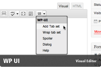
Image 1.1 WP UI -Visual mode Editor Menu
HTML Editor
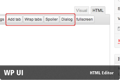
Image 1.0 WP UI - HTML mode Editor buttons
Example shortcode structures
Tabs
[wptabs style="wpui-quark"]
  [wptabtitle]Tab 1[/wptabtitle]
    [wptabcontent] Contents of the Tab 1 [/wptabcontent]
  [wptabtitle]Tab 2[/wptabtitle]
    [wptabcontent] Contents of the Tab 2 [/wptabcontent]
  [wptabtitle]Tab 3[/wptabtitle]
    [wptabcontent] Contents of the Tab 3 [/wptabcontent]
[/wptabs]
Accordion
Notice the argument type="accordion", that being the main difference against the tabs.
[wptabs type="accordion" style="wpui-dark"]
[wptabtitle]Tab 1[/wptabtitle]
  [wptabcontent] Contents of the Tab 1 [/wptabcontent]
[wptabtitle]Tab 2[/wptabtitle]
  [wptabcontent] Contents of the Tab 2 [/wptabcontent]
[wptabtitle]Tab 3[/wptabtitle]
  [wptabcontent] Contents of the Tab 3 [/wptabcontent]
[/wptabs]
Spoilers
[wpspoiler name="Fancy Slider"] Lorem ipsum dolor sit amet, consectetur adipiscing elit. Curabitur euismod, elit non tempor ornare.... [/wpspoiler]
Dialogs
[wpdialog title="The second dialog" hide="slide"] Text inside or what you want to show inside the dialog.. [/wpdialog]
Tabs and accordions
Step 1 . Tab's name - Shortcode : [wptabtitle]
You can use the shortcode [wptabtitle] to define the tab's name. This is the name that is displayed on the clickable tab.
Example follows:
[wptabtitle]Tab 1[/wptabtitle]
This assigns the tab's name as "Tab 1" and assigns the content or following [wptabcontent] to this tab.
Step 2 . Tab content - Shortcode [wptabcontent]
You can use the tab's content with the buttons labeled Tab Contents( Visual and HTML ). Refer to image 1.0 and 1.1 - labelled ( 2 ).
[wptabcontent] shortcode is used to define the content of the tab's panel - one that is displayed when clicking the tab.
Example :
[wptabcontent]Contents of the Tab 1. Remember we defined a wptabtitle shortcode before with a same name? And all the other awesome, cool stuff that i'd love to explain about! [/wptabcontent]
wptabtitle and wptabcontent shortcodes act as a pair, you can define as many as necessary. Think of this as a file and wptabtitle as a tag.
Repeat :)
Now for each additional tab, repeat the steps 1 and 2. Most of the times it is easier to use shortcodes.
Step 3 - Final - Wrapping
Once you are done with the tabset( wptabtitle and wptabcontent shortcodes), finally you can wrap it with the [wptabs] shortcode. Refer to ( 3 ) in Images 1.0 and 1.1 .
It is as easy as the previous ones.
[wptabs]
 [wptabtitle]First Tab[/wptabtitle]
   [wptabcontent] Contents of the first tab. [/wptabcontent]
 [wptabtitle]Second Tab[/wptabtitle]
   [wptabcontent]Content of the second tab. Roughly parallel another content[/wptabcontent]
[/wptabs]
Wow! There is your tabset, ready to rock! Now please save the post, and view it on the blog!
Where are my accordions?
Accordions and tabs share the same shortcode structure. the argument - type="accordion" to wptabs initializes the accordion.
[wptabs type="accordion"] ... rest same as tabs.
Advanced
Arguments for the shortcodes
Arguments for tabs and accordion shortcodes
| Arguments | Values |
|---|---|
| load | URL to the page your want to load through AJAX. |
| post | ID of the post you want to load into the tab |
| page | ID or name of the page you want to load into the tab. |
| cat | ID or name of the category to load posts from. |
| tag | Name or ID of the Tag to load posts from. |
| number | Number of posts to load from the category or tag, if given. |
| before_post | This appears before the post |
| after_post | This appears after the post |
| Arguments | Values |
|---|---|
| none yet | wptabcontent shortcode handles the tab's contents should follow [wptabtitle] shortcode, except when the latter is used with post related arguments, post, page, cat, tag. |
| Arguments | Values |
|---|---|
| type | Tabs or accordion. Choose type="accordion". |
| style | Any of the accepted stylename values, given just below the table.[wptabs style="wpui-achu"] |
| mode | Define mode="vertical" for vertically oriented tabs. |
| effect | Effect to be used with the tabs. Accepted values are "fade" or "slide". [wptabs effect="fade"] |
| style | Any of the accepted stylename values, given just below the table.[wptabs style="wpui-achu"] |
| rotate | Tabs auto rotation. It's value need to be in microseconds eg:4000 or 4s ( 4 seconds ). [wptabs rotate="6000"] is same as [wptabs rotate="6s"] |
| Position | Position of the tabs. position="bottom" moves the tabs to the bottom |
Arguments related to the post functionality
| Arguments | Value |
|---|---|
| All arguments | This shortcode is basically the [wptabs] shortcode, so all the options apply. |
Arguments related to spoiler
| Arguments | values |
|---|---|
| name | Name/Title of the spoiler. |
| style | Any of the accepted stylename values, given just below.[wptabs style="wpui-achu"] |
| fade | Fade(animate opacity) on open/close. [wpspoiler fade="true"] |
| slide | Slide on open/close. [wpspoiler fade="true"] |
| speed | Animation speed in milliseconds. Greater the value, slower the animation. |
| closebtn | Inserts a close button at end of the spoiler, with value as the label. [wpspoiler closebtn="Click to close me"] |
| showText | Text or HTML show on the closed spoiler i.e when content is hidden. [wpspoiler showText="Click to show"] |
| hideText | Text or HTML show on the open spoiler i.e when content is visible. [wpspoiler hideText="Click to hide"] |
| open | When this is set to true, Spoiler is open ( the content is visible ) at page load. |
| post | ID of the post. This is loaded into the spoiler. When a post is specified, the post title is used as the name Argument. [wpspoiler post="1171"] |
| before_post | This appears before the post |
| after_post | This appears after the post |
Arguments related to dialogs
| Arguments | Values |
|---|---|
| title | Title of the dialog.[wpdialog title="Information regarding Unicorns"] |
| width | Width of the dialog, without the suffixing px value.[wpdialog width="600"] |
| show | Open animation. [wpdialog show="drop"] |
| hide | Animation when dialog is closed. [wpdialog hide="explode"] Click here for the values. |
| modal | [wpdialog modal="true"] makes an black transparent overlay appear. |
| auto_open | When set to false, dialog is not opened at page load. Instead a button is placed that can be clicked at any time to open the dialog. |
| openlabel | Can only be used with the above option, auto_open. Defines the label of the button. |
| position | Position of the dialog. [wpdialog position="bottom"]. Accepted values top, bottom, left, right |
| post | ID of the post that is to be loaded into the dialog. [wpdialog post="1175"] |
| openlabel | Can only be used with the above option, auto_open. Defines the label of the button. |
| before_post | This appears before the post |
| after_post | This appears after the post |
Nested tabs
If you wish to have nested tabs (tabs within a tab), you have to use the following markup. This is rather a limitation of the wordpress shortcodes and not of this plugin.
<div class="wp-tabs wpui-quark">

	<h3 class="wp-tab-title">First Nested Tab</h3><br>
		<div class="wp-tab-content"> Contents of the nested first tab.
		</div><!-- end div.wp-tab-content -->

	<h3 class="wp-tab-title">Second Nested Tab</h3>
		<div class="wp-tab-content">Content of the nested second tab. </div><!-- end div.wp-tab-content -->

</div>
This enables the use of nested tabs.